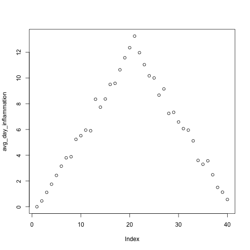
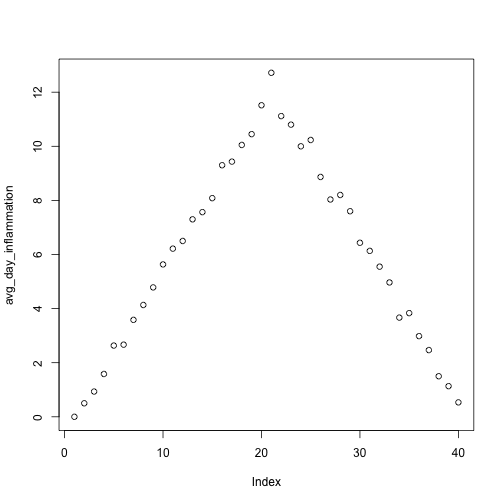
Image 1 of 3: ‘Scatterplot of average daily inflammation over 40 days, increasing in a mostly straight line until day 20, and then decreasing in a mostly straight line to visualise inflammation levels in a single dataset.’
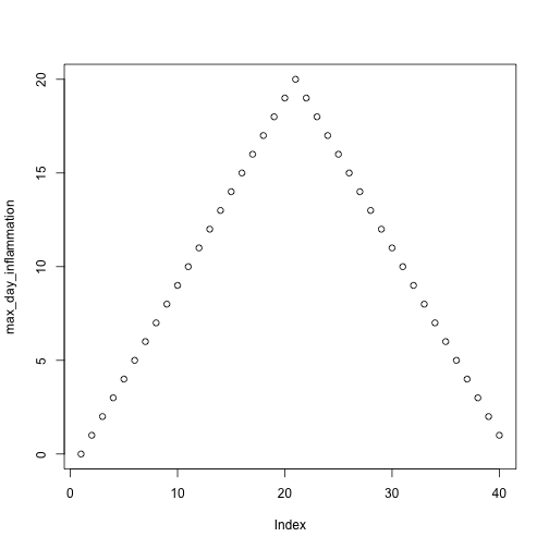
Image 2 of 3: ‘A scatterplot of maximum daily inflammation over 40 days, increasing in a straight line until day 20, and then decreasing in a straight line to visualise inflammation levels in a single dataset.’
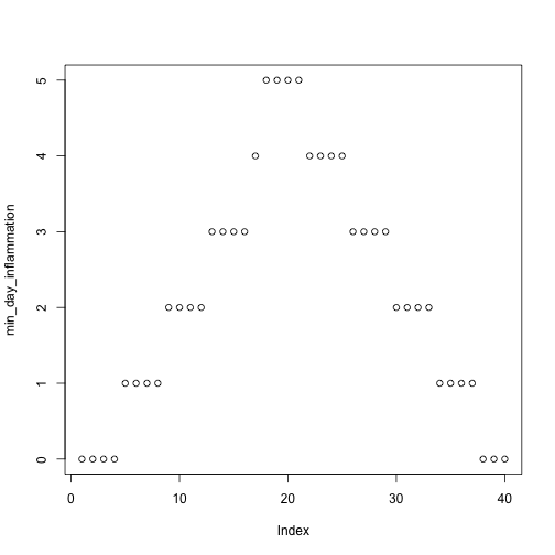
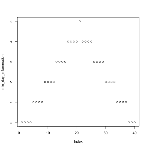
Image 3 of 3: ‘A scatterplot of minimum daily inflammation over 40 days, increasing in a step-wise pattern until day 20, and then decreasing in a step-wise pattern to visualise inflammation levels in a single dataset.’
Figure 2
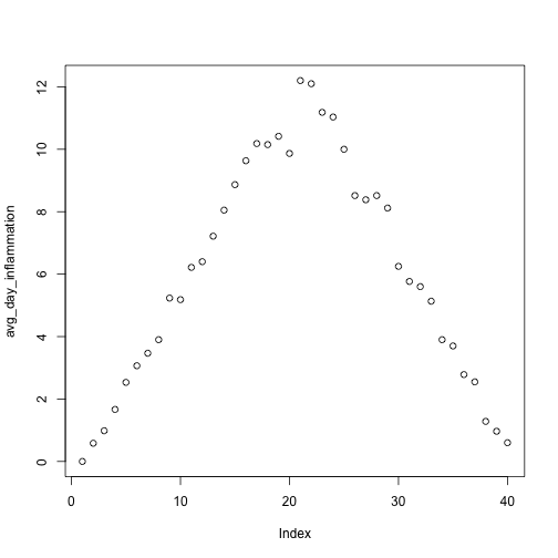
Image 1 of 3: ‘A scatterplot of average daily inflammation over 40 days, increasing in a mostly straight line until day 20, and then decreasing in a mostly straight line to visualise inflammation levels in a single dataset.’
Image 2 of 3: ‘A scatterplot of average daily inflammation over 40 days, increasing in a mostly straight line until day 20, and then decreasing in a mostly straight line to visualise inflammation levels in a single dataset.’
Image 3 of 3: ‘A scatterplot of average daily inflammation over 40 days, increasing in a mostly straight line until day 20, and then decreasing in a mostly straight line to visualise inflammation levels in a single dataset.’
Figure 3
Image 1 of 3: ‘Scatterplot of average daily inflammation showing a ramp with a peak at 20 days.’
Image 2 of 3: ‘Scatterplot of average daily inflammation showing a ramp with a peak at 20 days.’
Image 3 of 3: ‘Scatterplot of average daily inflammation showing a ramp with a peak at 20 days.’
Figure 4
Image 1 of 3: ‘Scatterplot of average daily inflammation showing a ramp with a peak at 20 days.’
Image 2 of 3: ‘Scatterplot of average daily inflammation showing a ramp with a peak at 20 days.’
Image 3 of 3: ‘Scatterplot of average daily inflammation showing a ramp with a peak at 20 days.’
Figure 5
Image 1 of 3: ‘Scatterplot of average daily inflammation showing a ramp with a peak at 20 days.’
Image 2 of 3: ‘Scatterplot of average daily inflammation showing a ramp with a peak at 20 days.’
Image 3 of 3: ‘Scatterplot of average daily inflammation showing a ramp with a peak at 20 days.’


 2. In addition to