Population Health Trend Dashboard
Chronic disease prevalence tracking by region and demographic, built to support policy and resourcing decisions across South Australia.
A public-sector stakeholder engaged Doppeldata to replace a cycle of one-off, quickly-stale reports with a single continuously-updating view of chronic disease trends across their region.
- Replaced repeated static reports with one continuously-updating dashboard
- Surfaced a regional divergence in prevalence trend invisible in prior annual reporting
- Left the stakeholder able to interrogate the data directly rather than commissioning a new report each time
The report that was always out of date
The stakeholder’s problem wasn’t a lack of data - it was the shape of how they consumed it. Every time a question came up about chronic disease trends, someone commissioned a report; by the time it was written, reviewed and delivered, the underlying figures had moved and the next question had already formed. Worse, each report answered exactly one framing of one question. Ask about a different region, a different age band, or a different point in the trend, and the whole cycle started again. What they needed was to stop buying answers one at a time and instead own a view they could query themselves - one that never went stale.
Making the data speak for itself
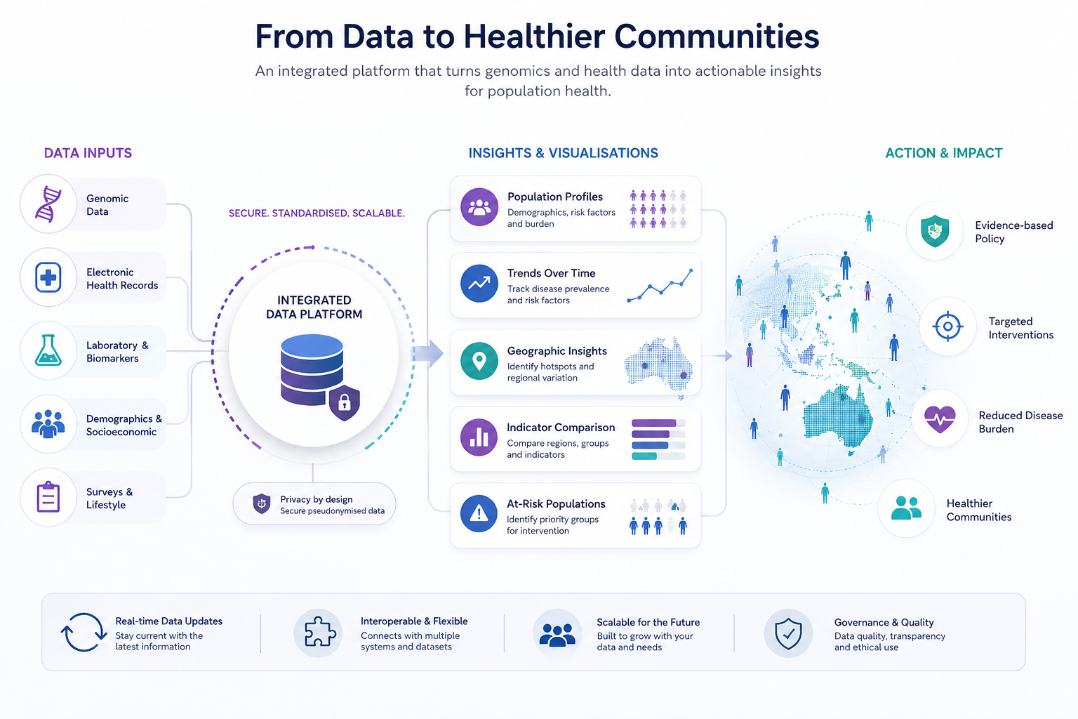
The heart of the work was turning a reporting habit into a living system. Rather than a one-off extract, the routinely-collected chronic disease indicators were fed through a pipeline on a defined refresh schedule, so the numbers on screen were always current without anyone touching them. Crucially, prevalence figures were handled with the standardisation that population comparisons demand - comparing a young region to an ageing one on crude rates would have manufactured differences that were really just differences in age structure. The data was then organised along the axes the stakeholder actually thought in - region, demographic group, time - so that any slice could be filtered and compared rather than locked into a single pre-baked snapshot. All of it was documented so that future refreshes extended the system rather than triggering a rebuild.
What surfaced once it was live
The most telling outcome wasn’t the dashboard itself but what it revealed the moment the data could be viewed dynamically: a divergence in prevalence trend between regions that the previous annual, aggregate reporting had smoothed away entirely. Because the stakeholder could now interrogate trends, rate-of-change and regional comparisons in one place, that kind of finding surfaced on its own rather than waiting for someone to happen to commission the exact report that would have exposed it.
Why a living view beats a fixed one
Population health questions almost never have a single fixed answer - they shift by region, by demographic, and over time, and any static report freezes one arbitrary slice of a moving picture. A view that stays current and can be re-sliced on demand is worth more than a report that is precisely accurate for one moment and quietly misleading by the next quarter. The shift from commissioning reports to owning a queryable system changed not just the stakeholder’s turnaround time but the kinds of questions they could afford to ask at all.

Bioinformatics, statistical genomics & computational biology - practical tools, learning resources, and expert guidance based in South Australia. We are a community that believes in accessible knowledge and learning together.