Spatial Epidemiology & Disease Hotspot Mapping
SA2-level cluster detection and geographic accessibility modelling to support regional and rural health service planning.
A regional health planning team came to Doppeldata with a map they didn’t trust. Disease looked concentrated in some areas and sparse in others, but they suspected - rightly - that the busiest-looking places were simply the most populated, and that the communities carrying the heaviest real burden might be the ones furthest from help. They needed the map redrawn on statistical foundations, and they needed it to answer two questions at once: where is risk genuinely concentrated, and who can actually reach care.
- Identified statistically significant disease clusters invisible in raw case counts
- Flagged rural catchments with disproportionately long travel to the nearest service
- Delivered an interactive regional map used directly in service-planning discussions
Two maps, not one
The core difficulty was that “where the cases are” and “where the risk is” are different maps, and neither is the map that matters for planning on its own. Raw counts track population - a city suburb will always outnumber a rural town in absolute cases without being at higher risk. A rate map corrects for that but goes noisy in small populations, where a handful of cases swings a rate wildly. And even a clean risk map says nothing about the second question the team actually needed answered: whether the people in a high-risk area could physically get to a service. The brief, distilled, was to produce a burden map that was statistically defensible and an access map that reflected the reality of distance and catchment - then read them together.
From raw points to a defensible picture
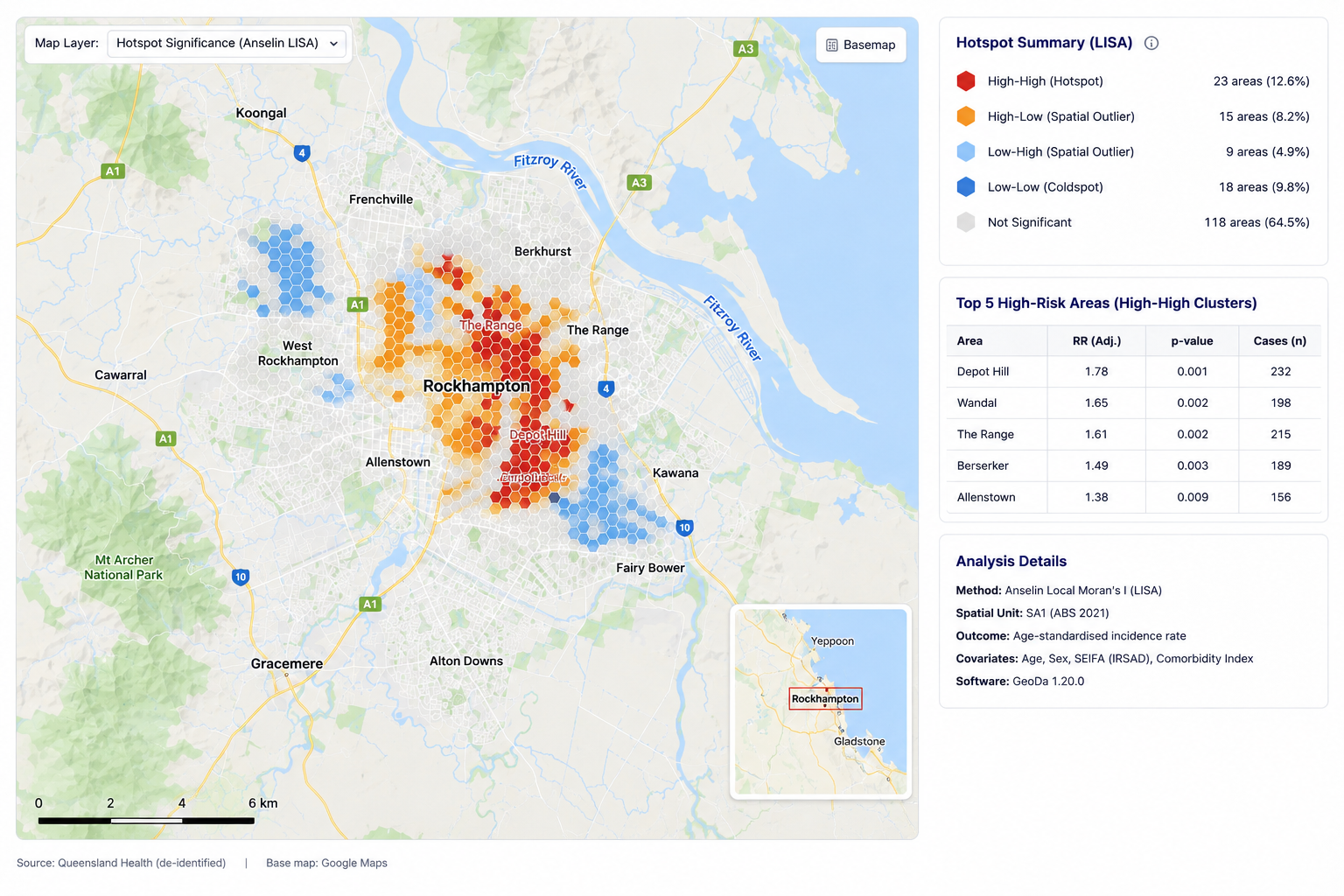
Rather than a fixed pipeline, the work was a sequence of statistical decisions. Case data was first aggregated to SA2 statistical regions - small enough to be granular, large enough to be stable - and tested for spatial autocorrelation to confirm there was genuine structure to find rather than noise. Scan-statistic cluster detection then identified areas where the concentration of cases was significantly higher than chance would produce given the underlying population, separating true hotspots from density artefacts. In parallel, healthcare access was modelled through distance-to-service and catchment analysis across regional and rural boundaries, surfacing the places where a service existed nominally but was effectively unreachable. The final step was interpretive: overlaying demographic and socioeconomic context so that a cluster driven by genuine exposure could be told apart from one driven by lack of access - a distinction that determines whether the right response is a screening program or a service-location decision.
What the analysis surfaced
Two statistically significant clusters emerged that had been completely hidden in the raw case counts - areas the team would not have prioritised on the strength of the tallies alone. The access modelling flagged three rural catchments where travel to the nearest service was disproportionately long, isolating them as distinct from the high-count urban areas that dominate a naive map. Presented as an interactive map the team could interrogate directly, the findings fed straight into the region’s service-planning discussions rather than sitting in a static report.
Why it held up
A heat map and a cluster analysis can look almost identical and mean entirely different things - one shows where it’s busy, the other shows where it’s statistically unusual, and only the second belongs in a resourcing decision. By grounding the burden map in scan statistics rather than impression, and by treating access as its own dimension rather than assuming proximity, the work let the team act on where risk genuinely concentrated and where people genuinely couldn’t reach care - two questions that, answered together, point to very different and more defensible interventions than either map alone.

Bioinformatics, statistical genomics & computational biology - practical tools, learning resources, and expert guidance based in South Australia. We are a community that believes in accessible knowledge and learning together.